Um eine grafische Oberfläche bestehend aus mehreren UI-Komponenten designen zu können, benötigen Sie ein Layout. Layouts haben die Aufgabe, die einzelnen UI-Komponenten einer grafischen Oberfläche anzuordnen und steuern vollautomatisch das Verhalten der UI-Komponenten bei Änderungen der Größe des übergeordneten Containers (u.a. Programmfenster, Browser-Fenster, Geräte-Display, Bildschirmauflösung). Sobald Sie eine UI-Komponente in ein Layout einfügen, wird diese nach den speziellen Regeln des jeweiligen Layouts automatisch positioniert und das Layout neu organisiert. Durch zusätzliche Einstellungsmöglichkeiten in der Toolbox können Sie das Verhalten der einzelnen UI-Komponenten definieren. RapidClipse bietet Ihnen insgesamt 6 verschiedene Layout-Typen:
Hinweis:
- Content - Die Größe einer UI-Komponente wird standardmäßig durch ihren Content (Inhalt) definiert, z.B. durch eine Beschriftung, Icon oder durch eine andere UI-Komponente. Erhält eine UI-Komponente in einem Layout zu wenig Platz, kann das Layout zur Entwicklungszeit kollabieren (kann rückgängig gemacht werden), während zur Laufzeit der Content ggf. abgeschnitten wird oder aus der UI-Komopnente heraus ragt.
- Streckung - In einem Layout kann eine UI-Komponente nur dann gestreckt werden (Toolbox > Width > %), wenn diese eine Gewichtung (Weight) erhält.
- Layout-Verschachtelungen - Komplexere Oberflächen mit einem einzigen Layout umzusetzen, kann sehr mühsam sein und häufiges Umbauen erforderlich machen. Sehr viel einfacher, variabler und effizienter ist es, je nach Anwendungsfall verschiedene Layouts durch Verschachtelung miteinander zu kombinieren.
- Performance im Browser - Zu viele Layout-Verschachtelungen mit entsprechend vielen UI-Komponenten darin können zu Performance-Problemen beim Rendern der Oberfläche im Browser, ggf. sogar zu Fehlermeldungen führen.
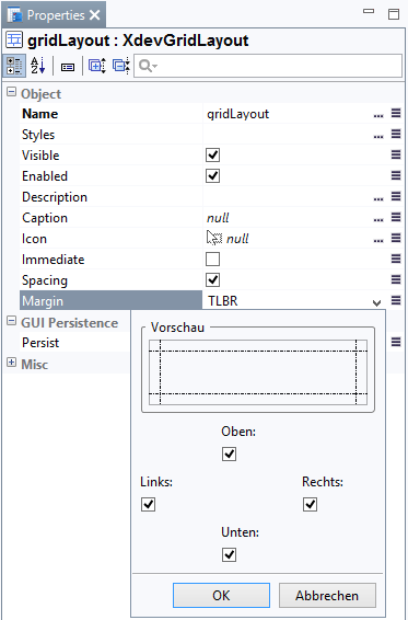
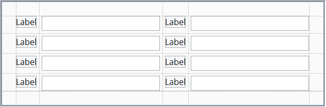
Außenabstand (Margin)
In den Properties > Margin kann zwischen dem Rand des Containers und der darin gelayouteten UI-Komponenten ein Außenabstand festgelegt werden. Bei allen Layouts ist der Außenabstand standardmäßig aktiviert.
Mit Außenabstand:
Ohne Außenabstand:
- Selektieren Sie bei Structure das Layout.
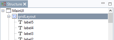
- Klicken Sie bei Properties > Margin > TLBR auf
 .
. - Legen Sie im folgenden Assistent die enstperchenden Außenabstände fest.
Innenabstand (Spacing)
In den Properties > Margin kann zwischen den UI-Komponenten ein Innenabstand festgelegt werden. Bei allen Layouts ist der Innenabstand standardmäßig aktiviert.
Mit Innenanbstand:
Ohne Innenabstand:
...
To design a graphical user interface with several UI components, you need a layout. Layouts help you arrange the single UI components of a graphical user interface and automatically control the behavior of UI components in the event you make changes to the size of the parent container (including program window, browser window, device display, and screen resolution). When you add a UI component to a layout, it is automatically positioned according to the specific rules of the layout, and the layout is reorganized. Additional settings in the Toolbox menu allow you to define the behavior of the individual UI components. RapidClipse offers six different layout types, as follows:
Note:
- Content - By default, the size of a UI component is defined by its content; e.g., by a caption, icon, or any other UI component. If a UI component in a layout has too little space, the layout may collapse during the development (this can be undone), while at runtime the content may be cut off or may protrude from the UI component.
- Stretching - In a layout, a UI component will only be stretched (Toolbox > Width > %) if given weight (weight).
- Layout nestings- Implementing complex interfaces in a single layout can be painstaking and may require frequent rebuilding. However, depending on the specific use case, it can be much more efficient to use nesting to combine different layouts, and it may offer you more variety.
- Performance in the browser - Too many layout nestings with a corresponding high number of UI components may cause performance problems when rendering the interface in the browser and it can even lead to error messages.
Margin
You can determine a margin between the border of the container and the UI component laid out within it by using the Properties > Margin menu. In all layouts, the margin is enabled by default.
With margin:
Without margin:
- Select the layout in Structure.
- Under Properties > Margin > TLBR, click.
- In the deployment wizard, set the appropriate margins.
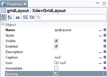
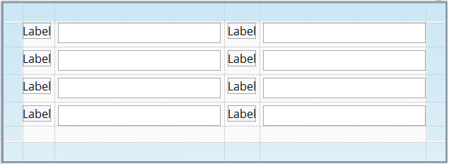
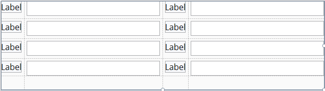
Spacing
Under Properties > Margin you can determine the spacing between the UI components. In all layouts, the spacing is enabled by default.
With spacing:
Without spacing:
- Select the layout in Structure.
- Select Spacing.