Most Important Properties
- Copy Page Tree
- RapidClipse Translator Services
Here is a list of the major Properties in alphabetic order. Most UI components only have some of the properties listed.
Auto query data - Automatically performs a database query and fills the entity connected to the UI component. Data that can’t be displayed will be lazily loaded (lazy-loading). The XdevLazyEntityContainer will be used as Data Container.
Caption - Displays text as label.
Columns - Defines the width of a form component in columns. A column roughly equals one character. The setting is only relevant if the setting in Toolbox > Width > ? (Undefined).
Connected form - Connects the UI component (master) to the specified XdevFieldGroup (detail).
Converter - A wizard that allows you to define formatting for a field (e.g.; date or currency symbol) and to convert strings into a specific data type.
- ConversionError - Error message that appears if a conversion defined in the Converter fails.
Description - Text displayed at runtime as a tooltip when you touch it with the mouse pointer.
DisableOnClick - Only allows a one-time single click and then disables the XdevNativeButton.
- Enabled
Entity - Connects the assigned entity to the UI component.
- Properties - Shows the attributes of the connected entity, specified here, in the UI component e.g. {%company}. You can also display multiple attributes, such as {%company}, {%carmodels}, {%price}. Thus, the potential settings made in the Entity Editor will be overwritten in Settings > Entity caption as well as in Properties > ItemCaptionValue.
- Data - Instead of the default search strategy of Auto query data, it uses the query method findAll or a custom query method. findAll transmits the entire query result and uses the XdevBeanItemContainer as a data container. Lazy loading is not supported.
- Hierarchy - Only for XdevTree.
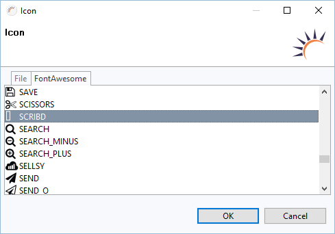
Icon - Displays an icon in the UI component. With the Icon Wizard you can embed your own files or the included FontAwesome Icons.
Immediate - By default, the flag is not set. Any changes to the UI component will be automatically transmitted to the server. Thus, potential delays due to other events are tolerated. Once the flag is set, any changes will be immediately transmitted to the server.
InputPrompt - Input prompt directly in the component form. Disappears after input.
ItemCaptionFromAnnotation - Displays attributes of the connected entity in the UI component. These attributes were globally defined in the Entity Editor in Settings > Entity caption, e.g. {%company}, {%carmodels}, {%price}.
ItemCaptionValue - Shows the attributes for the connected entity, specified here, in the UI component e.g. {%company}. You can also display multiple attributes, such as {%company}, {%carmodels}, {%price}. Thus, any potentially set global setting in the Entity Editor will be overwritten in Settings > Entity caption.
LeftColumnCaption - Sets text as caption for the left column.
Margin - Adds a space between the current element and its parent and neighboring elements.
Master component - Master component connected to the UI.
MaxLength - Maximum number of characters in an XdevTextField. If -1 is specified, the number of characters is unlimited.
MultiSelect - Allows multiple selections.
Name - Name for the UI component in the code. The name is automatically assigned by RapidClipse, e.g. button. To avoid unnecessary typing, the prefix XDEV from the class name XdevButton was not added here. As the name must be clear and unique, the name of all UI components of the same type that are subsequently added to the GUI builder will be automatically transfixed with a number, e.g. button1. You should rename the generated default name to make it as self-explanatory as possible. According to common convention, the name should consist of the UI component type followed by its technical meaning, e.g. button customer form. First, this makes coding easier as you will achieve ideal code completion and, secondly, your code will be a lot easier to read. When Hungarian notation is applied, the types are abbreviated using only three or four characters, e.g. btn for button. However, given the large number of different UI components RapidClipse already offers, it is advisable that you use the full name of the UI component type.
PageLength - Displays the specified number of entries.
Persist - This setting notifies the GUI Persistence Framework that the state of this element should be persisted.
PersistValue - This setting notifies the GUI Persistence Framework that the current value of this element should be persisted as well as the current state.
- ReadOnly
Required - The form component is defined as a mandatory field. You need to make a selection from the available options, complete the field, or select the required option.
RequiredError - An error message that appears when a form component that is defined as a mandatory field is not filled out, selected or no selection has been made.
Resource - URL to be invoked. The URL must begin with http: //.
RightColumnCaption - Text for the caption of the right column.
Rights - Displays a wizard that can be linked to the user rights component. The setting is only visible if the authorization for this project is active.
Rows - Defines the height of a form component in rows. A row is roughly equal to the height of a character. This setting is only relevant if Toolbox> Height is set to ? (Undefined) or you are using an AbsoluteLayout.
ScrollToSelectedItem - When a drop-down list is activated, the system automatically scrolls to the value set in the XdevComboBox.
- Shortcut
Spacing - Inserts a space between the child elements of a layout.
Split Position - The value of the splitter position in the unit, set in Split Position Unit. At runtime, the set value is taken as a starting position (default value).
Split Position Unit - Unit of the value set for the position of the splitter in Split Position. The available units are pixels and percentages.
Styles - The UI component can be assigned pre-defined styles. A combination of styles is possible. This list shows all the available standard styles; however, not all styles work efficiently in all UI components. Custom styles will also appear in the list.
TabIndex - Defines the sequence in the tab index. The tab index defines the order of several UI components. These can be selected one by one by pressing the Tab key.
TextChangeEventMode - Determines when exactly the textChange event is triggered.
LAZY - Default setting. The event is triggered only if there is a timeout after the last change. The length of the timeout can be defined in Properties > Misc > TextChangeTimeout.
- EAGER - The event is triggered at each keystroke.
- TIMEOUT - The event is triggered only if there is a timeout after the last change.
TextChangeTimeout - Defines the length of the timeout, after which the textChange event is triggered, in milliseconds.
TextInputAllowed - Allows you to enter values. With each new entry, the drop-down list is automatically re-filtered.
- FilteringMode - filtering option.
- null - errors
- OFF - Does not filter the drop-down list.
- STARTSWITH - Default setting. Displays all entries that begin with the search term.
- CONTAINS - Displays all entries that contain the search term.
- FilteringMode - filtering option.
Value - Text or value intended to represent the UI component.
- Visible
XDEV Software Corp. - One Embarcadero Center, San Francisco, CA 94111, US
Copyright © 2015. XDEV Software Corp. All rights reserved.