XdevComboBox
- Copy Page Tree
- RapidClipse Translator Services
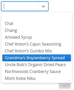
The XdevComboBox is a combination of an input field, a button, and a drop-down list, from which the user can select a value. The drop-down list predominantly contains the values contained in a given column in the database table.
The input field of an XdevComboBox is editable by default. The drop-down list entries are automatically re-filtered in accordance with each input. The selected entry is displayed in the XdevComboBox. The XdevComboBox is a form component and can be persisted via the XdevFieldGroup.
Important properties:
Auto query data - Automatically performs a database query and fills the entity connected to the UI component. Data that can’t be displayed will be lazily loaded (lazy-loading). The XdevLazyEntityContainer will be used as Data Container.
Connected form - Connects the UI component (master) to the specified XdevFieldGroup (detail).
Entity - Connects the assigned entity to the UI component.
- Properties - Shows the attributes of the connected entity, specified here, in the UI component e.g. {%company}. You can also display multiple attributes, such as {%company}, {%carmodels}, {%price}. Thus, the potential settings made in the Entity Editor will be overwritten in Settings > Entity caption as well as in Properties > ItemCaptionValue.
- Data - Instead of the default search strategy of Auto query data, it uses the query method findAll or a custom query method. findAll transmits the entire query result and uses the XdevBeanItemContainer as a data container. Lazy loading is not supported.
- Hierarchy - Only for XdevTree.
ItemCaptionFromAnnotation - Displays attributes of the connected entity in the UI component. These attributes were globally defined in the Entity Editor in Settings > Entity caption, e.g. {%company}, {%carmodels}, {%price}.
ItemCaptionValue - Shows the attributes for the connected entity, specified here, in the UI component e.g. {%company}. You can also display multiple attributes, such as {%company}, {%carmodels}, {%price}. Thus, any potentially set global setting in the Entity Editor will be overwritten in Settings > Entity caption.
Master component - Master component connected to the UI.
PageLength - Displays the specified number of entries.
- ReadOnly
Required - The form component is defined as a mandatory field. You need to make a selection from the available options, complete the field, or select the required option.
RequiredError - An error message that appears when a form component that is defined as a mandatory field is not filled out, selected or no selection has been made.
ScrollToSelectedItem - When a drop-down list is activated, the system automatically scrolls to the value set in the XdevComboBox.
TabIndex - Defines the sequence in the tab index. The tab index defines the order of several UI components. These can be selected one by one by pressing the Tab key.
TextInputAllowed - Allows you to enter values. With each new entry, the drop-down list is automatically re-filtered.
- FilteringMode - filtering option.
- null - errors
- OFF - Does not filter the drop-down list.
- STARTSWITH - Default setting. Displays all entries that begin with the search term.
- CONTAINS - Displays all entries that contain the search term.
- FilteringMode - filtering option.
Important events:
valueChange - Is triggered after changes to the content, mainly by adding or deleting characters, however only if the UI component loses the focus.
Data binding:
- Data container (model)
XdevBeanItemContainer - Standard data container. The allocation is set using the setContainerDataSource method.
// Generates a new XdevBeanItemContainer 'productList'
XdevBeanItemContainer<Product> productList = new XdevBeanItemContainer<Product>(Product.class);

// Sets the XdevBeanItemContainer
comboBox.setContainerDataSource(productList);
- XdevLazyEntityContainer - RapidClipse exclusively uses this when the property Entity > Auto query data is selected.
Examples:
Add entries - Manually add entries to the XdevComboBox.
comboBox.addItem("Eintrag 1");
comboBox.addItem("Eintrag 2");
Direct allocation of multiple entries.
listSelect.addItems("Eintrag 1", "Eintrag 2", "Eintrag 3", "Eintrag 4");Selected object - Returns the selected object (entity) - Example: category entity.
Category Category = comboBox.getSelectedItem();
or
Category Category = (Category)comboBox.getValue();
Remove elements - Removes all the elements from the XdevComboBox.
comboBox.removeAllItems();
Select element - Automatic selection of an entry - Example: first entry.
Collection<?> itemIds = comboBox.getItemIds();
comboBox.setValue(((List<Category>)itemIds).get(0));
Reset selection - Sets the selection to the initial state. This triggers a valueChange event.
comboBox.clear();
Read random value of the selected object - Example: "Category name"
String categoryName = comboBox.getSelectedItem().getBean().getCategoryname();
Read XdevComboBox data - Generates a new XdevBeanContainer productContainer of Product category and assigns this with the getContainerDataSource method to XdevBeanContainer of the XdevComboBox.
XdevBeanContainer<Product> productContainer = comboBox.getContainerDataSource();
All XdevComboBox Methods
Note:
- XdevComboBox > Properties > FilteringMode > null leads to error.
Related content
XDEV Software Corp. - One Embarcadero Center, San Francisco, CA 94111, US
Copyright © 2015. XDEV Software Corp. All rights reserved.